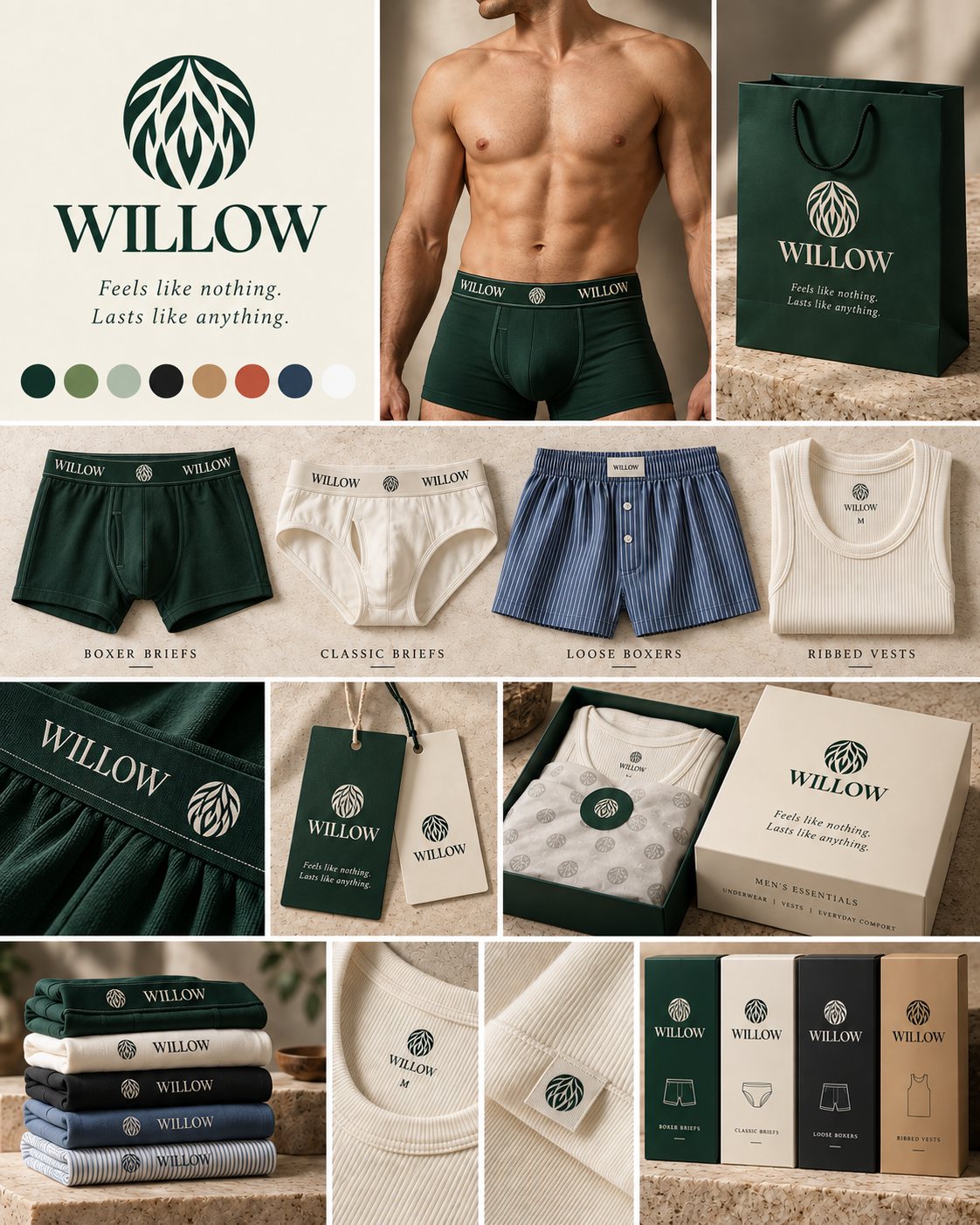
Men's essentials
Feels like nothing.Lasts like anything.
How Willow looks, sounds and shows up: from a waistband in Lahore to a WhatsApp message in Karachi. Use this guide whenever you make something with our name on it.


Essence
Willow makes men's underwear, vests and everyday essentials for Pakistan. We sell the feeling of not noticing what you're wearing, and the proof that it keeps feeling that way, wash after wash.
Feels like nothing.
Lasts like anything.
- Feels like nothing
- The comfort promise. Fit that doesn't ride, dig or need fixing, in fabric that breathes through 40 degrees.
- Lasts like anything
- The durability promise. Waistbands that don't roll, fabric that doesn't thin, colour that doesn't fade.
- The test
- If copy, a photo or a product decision doesn't support one of these two lines, it doesn't belong.
Brand pillars
| Pillar | What it means |
|---|---|
| Invisible comfort | Fit that doesn't ride, dig or need fixing; fabric that breathes in the heat. |
| Built to last | Waistbands, seams and colour that survive the washing machine. |
| Quietly premium | Natural palette, calm design, thoughtful packaging. Premium you feel rather than see. |
| Honest essentials | Clear sizing, plain facts, fair prices for multipacks. |
Personality
Calm, not sleepy. Confident, not cocky. Warm, not cute. Natural, not preachy. Think of a well-dressed friend who recommends something once, and is right.
A willow bends without breaking. That is the product: soft and flexible, but resilient. The mark is a canopy of willow leaves held inside a circle, growth kept in a clean, lasting shape.
Rules at a glance
- Use the supplied logo files. Never redraw, re-type or recolour them outside the approved inks.
- Set type in Willow Green on Linen, or Linen on Willow Green. Near-black is for long body text and legal copy only.
- Headlines in Cormorant Garamond at medium weight; the tagline always in italic; body and interface in Jost.
- Three colours per layout: Willow Green, Linen and one supporting colour. Clay is for offers only.
- Product colours are fabric colours. Never use them as backgrounds for the logo or campaign layouts.
- Soft shapes: pill buttons, rounded cards and frames, one arch per view. Square corners only for full-bleed photos and the physical box.
- Every claim needs proof. Say "holds its shape after 100 washes" only when a fabric test backs it.
- Space is the luxury. When in doubt, remove something.
Who we're for
Men aged 18 to 34 in Lahore, Karachi and Islamabad/Rawalpindi who buy for themselves, two or three pieces at a time, and are tired of adjusting all day. From our September 2026 launch survey (52 complete responses); directional, not final.
| Finding | What it means for the brand | |
|---|---|---|
| 71% | rank comfort and fit first | The tagline is right. Lead with fit and fabric, follow with durability. |
| 81% | put fabric in their top three | Name the fabric and what it does, every time. |
| 8% | care about the brand name | Keep branding quiet. Earn trust with product proof, not logo size. |
| 33% | adjust during the day; 31% say it rides up | These are our product claims: legs that stay put, a shaped pouch, a waistband that doesn't roll. |
| 67% | prefer mostly plain colours | The core range is solid colour. Stripes stay in loose boxers and limited drops. |
| 52% | have never bought underwear online | Online trust is the job: size guide, fabric facts, cash on delivery, easy exchange, discreet packaging. |
| 71% | buy two or three pieces at once | The 3-pack is the hero unit. |
| 44% | left a WhatsApp number for early access | WhatsApp is a core channel, ahead of email. |
In their words
It should feel like it's not there.
Doesn't lose elasticity, doesn't become loose.
Different fabrics to suit our hot, humid climate.
Have good size guides.
Positioning
For Pakistani men who want basics that just work, Willow is the underwear and essentials brand that feels like nothing on the body and lasts far longer than local alternatives, because it is cut for real movement, made in breathable, shape-holding fabric for a hot climate, and tested wash after wash.
Voice and copy
Short sentences. Plain words. One idea per line. We say how it feels and how long it lasts, and we back it with a fact. A little dry humour is fine; innuendo is not.
We say
- Put it on. Forget it's there.
- Holds its shape after 100 washes.
- Made for a Karachi summer.
- Room in front. No pressure.
We don't say
- ULTIMATE COMFORT!!!
- Premium quality fabric.
- Pakistan's #1 underwear brand.
- Support where it matters.
The tagline
Lasts like anything.
Always the full two-sentence line, in italic, ideally on two lines. Don't paraphrase it, add to it or use half of it, except as a campaign headline where the other half follows in the body copy. Never lock it into the logo.
Mechanics
- Name: "Willow" in running text. Capitals belong to the wordmark only.
- Casing: sentence case for headlines, buttons and navigation ("Find my size"). Spaced capitals only for small eyebrows and labels.
- Punctuation: full stops in headlines are on-brand. No exclamation marks. No emoji in brand creative.
- Numbers: always numerals: 3-pack, 100 washes, PKR 2,400 (Rs 2,400 is fine on social).
- Product names: style first, then colour after a dash: Boxer Brief — Midnight Navy.
Proof lines
Use only when true, with test data behind them.
- No ride-up leg. Stays where you put it.
- A shaped pouch for room, not pressure.
- Tagless: the label is printed, not stitched.
- A waistband that doesn't roll, dig or give up.
- Breathes through 40 degrees.
- Colour that doesn't fade to grey.
Urdu and Roman Urdu
Social captions and WhatsApp may use Roman Urdu for warmth: "Size confusion? Humein message karein." Urdu script is set in Noto Nastaliq with generous leading. A suggested line for "Feels like nothing":
پہن کر بھول جائیں
Have every Urdu adaptation checked by a native copywriter. Never translate the tagline on the logo lockup itself.
Logo
Three parts: the stacked lockup, the wordmark and the willow mark. Always use the supplied artwork.



Clear space and minimum size

- Clear space on every side½ mark
- Stacked lockup96px · 25mm
- Wordmark72px · 18mm
- Wordmark on woven labels12mm
- Mark20px · 6mm
- Mark, embroidered or woven8mm
Approved colourways
- Willow Green on Linen or Chalk: the default.
- Chalk or Linen on Willow Green: the reversed default for waistbands, bags and tags.
- Sand on Charcoal or Ink: premium moments only.
- Chalk on Ink: black waistbands and the black box.
- Willow Green on Sand: the Kraft box.
On product, the logo takes the waistband's contrast colour: Chalk on Willow Green, Black, Navy and Charcoal; Willow Green on Chalk, Grey, Stone and Sky. The waistband repeat is WILLOW, mark, WILLOW, with the mark exactly centre-front.
Don't
- Stretch or squash

- Rotate
- Recolour
- Place on busy images
Also never redraw the leaves, re-type "WILLOW" in a font, add shadows or gradients, or use product colours such as Oxblood or Sky for the logo.
Colour
Two systems. The brand palette frames everything we make and stays fixed. The product palette is what customers wear, and grows every season. Select any swatch to copy its hex.
The 80 / 10 / 10 balance
Never use more than one supporting colour at a time.
Product palette
Fabric colours, grouped by how long they stay on the shelf. They appear on product, swatches and pack shots, never as a background for the logo.
Core
Always in stock in every style they suit.
- Jet Black#131414
- Chalk White#F6F5F5
- Midnight Navy#1F2A44
- Heather Grey#A7A9AC
- Stone#C9B49A
Signature
Our own colour, always in the hero Boxer Brief.
- Willow Green#1C3D30
Essential
Rotate slowly across the year.
- Charcoal Melange#4A4C4F
- Sky#A9C1D9
- Denim#344B65
Seasonal
One season at a time.
- Olive#5C6B45
- Oxblood#5E2229
- Sage#829C62
Limited
One drop a year, never core.
- Clay#CC6047
- Launch each new style in Core first (at least Black, Navy, Grey and White), plus Willow Green in the hero style.
- Keep roughly 70% of units in Core, 20% in Essential and 10% in Seasonal and Limited.
- In hero images and launch pages, lead with Core and Willow Green. Clay is one small accent piece, never the loudest thing in frame.
- Multipacks mix a dark, a neutral and one colour: Black, Grey and Willow Green, or Navy, Grey and Sky.
- Stripes (pinstripe or Bengal) on Denim, Sky or Navy with Chalk lines, for loose boxers only.
- Name new colours from nature, materials or places, two words at most.
Interface colour
Websites and apps use semantic tokens that switch between the Linen (light) and Forest (reversed) themes. Every text token meets WCAG AA contrast on the surfaces it is meant for.
| Token | Linen | Forest | Use |
|---|---|---|---|
surface | #F3EFE3 | #1C3D30 | Default ground: Linen on the light theme, Willow Green on the reversed theme. |
surface-raised | #FBF9F3 | #244A3B | Cards, product tiles and panels sitting on surface.. |
ink | #1C3D30 | #F3EFE3 | Primary text, headlines and the logo. |
ink-muted | #5B6560 | #B9C7BF | Secondary text, captions, helper text on surface and surface-raised in both themes (5.3:1 / 5.7:1 minimum).. |
brand | #1C3D30 | #F3EFE3 | Primary buttons, waistbands, hang tags, box lids, stickers. |
on-brand | #F3EFE3 | #1C3D30 | Text and marks placed on a brand fill (10.4:1 both themes).. |
accent-text | #7A5C38 | #D8C0A0 | Sand-toned text (eyebrows, 'New colour' labels) on surface and surface-raised: 5.4:1 Linen, 8.6:1 Forest.. |
signal | #A8452F | #E8927C | Clay for offers, launch prices and low-stock notes only, always paired with a word (e.g. |
hairline | #C9BFA6 | #3D5A4D | Decorative dividers, the stitch line on waistbands, card borders that carry no meaning.. |
border-strong | #77817B | #8FA396 | Input and control borders that must be seen: 3.5:1 on surface and 3.8:1 on surface-raised (Linen), 4.5:1 on surface (Forest).. |
focus | #CC6047 | #E8927C | Keyboard focus ring: 2px solid, 2px offset. |
Typography
Serif speaks, sans informs. Emotional lines in Cormorant Garamond, facts in Jost. All three families are free on Google Fonts.
Cormorant Garamond
Headlines, product names, the italic tagline, eyebrowsJost
Body, interface, labels, prices, size chartsNoto Nastaliq Urdu
Urdu copy on inserts, social and WhatsAppType scale
Feels like nothing.
Made for 40 degrees.
Boxer Brief
Feels like nothing. Lasts like anything.
BOXER BRIEFS
Soft cotton-modal that breathes through a Lahore summer.
Waistband holds its shape after 100 washes.
Cash on delivery across Pakistan.
SIZE M · 3-PACK
Find my size
پہن کر بھول جائیں
Rules
- Headlines stay at medium weight. Bold serif headlines read mass-market, not luxury.
- Italic is reserved for the tagline and short sign-offs.
- Left-align body text. Centre only short stacks: logo, tagline, box fronts, hang tags.
- Keep lines under about 65 characters. Scale headlines down by about a third on mobile.
- The wordmark is custom artwork; Cormorant sits beside it, it does not replace it.
Shape and layout
Modern luxury: calm, soft and spacious. The shapes take their cue from the mark, a circle full of curved leaves, so curves lead and hard corners are the exception.
Arch, 240px top corners
The signature. One hero image or panel per view: homepage and product heroes, posters, the green hang tag.
Pill, fully rounded
Every button, swatch, badge, filter chip and round sticker.
Soft frame, 28px
Photos inside layouts, banners, social panels, modals.
Soft card, 16px
Product tiles, cards, hang tags and insert cards.
Small soft, 8px
Inputs, size selectors and small labels.
Square, 0px
Only full-bleed photography and the physical box and bag.
What makes it read as luxury
- Space is the signal. Two products per row on mobile, three or four on desktop. One message per screen.
- One arch per view. Repeated, it becomes decoration.
- Hairlines, not heavy borders. No drop shadows; use a lighter or darker surface for depth.
- Restraint in colour. Sand appears as a thin line, a foil or a small detail.
- Materials over graphics. Stone, linen, soft-touch board and foil instead of patterns and illustration.
- Quiet motion. Slow fades and gentle rises, 300 to 500ms, ease-out. No bounces.
Iconography
Icons support facts about fabric, fit, care and delivery. They never decorate, and always sit beside a word.
- Breathable
- Soft fabric
- Waistband that holds
- Built to last
- Discreet delivery
- Free exchange
- Cash on delivery
- Size guide
Style
- Line icons only: 1.5px stroke at 24px, round caps and joins, no fills.
- Willow Green on light grounds, Linen on Willow Green. Never Sand, Sage or Clay.
- 24px grid; 32px in feature rows; never larger than 48px.
- Build a custom set from these, or start from Phosphor (Light) or Lucide at 1.5px. Don't mix sets on one page.
- At most four icons in a row. Care symbols on labels follow ISO 3758.
Imagery
Warm, natural and calm. Travertine and terrazzo, woven baskets, linen, raw wood. Warm daylight with soft leaf shadows, as if under a tree. One living branch, never more than two props.


Shot types
- Hero stills: two or three pieces on stepped plinths.
- Flat lays: product, gift box, tissue and tags from above.
- Stacks: folded colour stacks with the waistband logo showing.
- Detail macros: waistband stitch, ribbed texture, woven label. Proof of quality.
- On body: natural builds and relaxed posture, cropped chest to mid-thigh, a real range of body types and skin tones.
Cultural and platform fit
Pakistan is a conservative market, and Meta and TikTok restrict underwear-on-body ads. Lead paid and public creative with stills, flat lays and stacks. Keep on-body images for the product page and size guide, never sexualised, with no suggestive poses or captions. Show vests worn under an open shirt or kurta, the way customers actually wear them.
Before anything goes public
Check every visible "WILLOW" letter by letter. Generated images often garble the wordmark on waistbands and labels, and one misspelt logo undoes the premium feel.About these boards
They are AI-generated direction, not final assets. Reshoot with real product before launch.Avoid
- Studio-white e-commerce shots as brand imagery (fine for marketplace listings only).
- Gym flexing, oiled skin, or lingerie-style styling.
- Busy patterns or several bright colours in one frame.
- Text baked into photos.
Product and packaging
The brand frame stays green and linen whatever the product colour. A Navy trunk still ships in a green-and-linen box with a Willow Green tag.
On the product
- Waistband: jacquard or printed WILLOW, mark, WILLOW repeat in the contrast colour, with a hairline stitch along the top edge. Wordmark at 40 to 45% of band height.
- Loose boxers: elastic waist with a small woven Linen label at centre back.
- Neck and back labels: printed and tagless: mark, WILLOW and size. Customers named itchy tags as a top annoyance.
- Vests: printed neck label; an optional small woven mark flag on the lower side seam.
Packaging system
| Item | Colours and finish | Content |
|---|---|---|
| Style box | One colour per style: Willow Green (Boxer Brief), Chalk (Classic Brief), Ink (Loose Boxer), Sand (Ribbed Vest) | Mark and wordmark at top, a line drawing of the style, style name in spaced capitals |
| Gift and multipack box | Linen lid, Willow Green base | Lockup, italic tagline, "Men's essentials" and "Underwear | Vests | Everyday comfort" on the lid edge |
| Tissue | White with a Mist or grey repeat of the mark | Sealed with a round Willow Green sticker |
| Hang tag pair | Green tag (may be arch-topped) and Linen tag, 4mm rounded corners, jute or green cord | Front: lockup and tagline. Back: size, fabric, care, price, barcode |
| Insert card | Linen, 4mm rounded corners, soft-touch | Thank-you note, care, exchange promise |
| Shopping bag | Willow Green, rope handles | Lockup and tagline in Linen |
| E-commerce mailer | Plain Kraft or Willow Green | Mark only outside; nothing that says what's inside |
Sizing
Sizes S to XXL. Launch data suggests depth in M (46%) and L (29%), then XL. Every box and product page carries a size chart with waist in inches and centimetres.
Materials
Uncoated FSC board, soy or water-based inks, one foil at most (Sand, on premium gift boxes). Avoid plastic windows and polybags where the supply chain allows.
Range and expansion
One master brand, no sub-brand logos. Collections sit underneath it as plain names.
| Collection | Contents | Supporting colour | Timing |
|---|---|---|---|
| Willow Essentials | Boxer Brief, Trunk, Classic Brief, Loose Boxer, Ribbed Vest, Crew Vest | Mist | Launch |
| Willow Lounge | Lounge shorts, joggers, sleep tees, pyjama sets | Mist | Next |
| Willow Socks | Everyday crew and ankle socks in 3- and 5-packs | Denim | Next |
| Willow Active | Breathable sport boxer briefs, training tees | Sage | Later |
| Willow Gifting | Eid, wedding-season and birthday boxes | Sand | Seasonal |
What stays, what flexes
- Always fixed: logo, the green-and-linen packaging frame, typography, voice, tagline, hang tags.
- Per collection: the one supporting colour and the photography props.
- Per season: product colourways, following the tiers in Colour.
Naming
Willow plus the collection on packaging and navigation. Style plus colour on the product: "Trunk — Heather Grey". A fabric or feature name may follow as a plain descriptor ("Trunk — Heather Grey, Breathe fabric"), never as its own logo.
Packs and pricing
The 3-pack is the default on every core style, with singles for trial and a 5- or 7-pack as the value option. Frame price as value per wear and durability, not discounts. Test price points before fixing them.
Digital and social
Linen by default, Willow Green for hero bands and footers. Pills for every action, one primary action per view.
Website
- Wordmark in the sticky header; the stacked lockup is too tall for it.
- Primary button: Willow Green fill, Linen text. Secondary: 1px green outline. Both pills, 14 × 32px padding.
- Product tiles with 16px corners, photos in 28px frames, the hero product in the arch.
- A trust bar near the top of every product page: cash on delivery, free exchanges, discreet packaging, size guide.
- Keyboard focus: a 2px Clay ring with a 2px gap.
Waitlist and launch pages
- WhatsApp first. The main field is a mobile number with a fixed +92 prefix; email is an optional link. The button says what happens: "Get early access".
- The headline sells. The tagline is the headline; "Launching soon" lives in the small eyebrow above it.
- One row of four proofs from customer pain points. No repeating rows.
- A reason to join now: a launch price, what's launching, and the trust promises.
- After signup, two one-tap questions: size and preferred style.
- Mobile first: the signup field is visible without scrolling. White text on photos sits on a dark gradient. No dead navigation links.
Social
- Profile image: the mark, green on linen or linen on green.
- Grid rhythm: a product still, a detail macro, a text post (12 words at most), repeat.
- Stories and Reels: stretch tests, wash tests, product handling. Proof over polish.
- Carousels: a claim first ("Doesn't ride up."), then the proof, then the pack and price.
Short, warm, in the customer's language (English or Roman Urdu). Sign off "— Team Willow" and always offer size help.
Marketplaces
White-background product shots with the waistband logo visible, plus one lifestyle frame. Titles follow: Willow Boxer Brief 3-Pack — Black, Grey, Navy.
Downloads
Everything you need to start. For print, request vector masters from the Willow team.
Logo pack
Seven transparent PNGs, lockup, wordmark and mark. ZIP, 110 KB
Design tokens, CSS
Colours, fonts, spacing and radius as CSS variables, both themes
Design tokens, JSON
Every token with its usage note, for developers and tools
DESIGN.md
The design contract for developers and AI coding agents. Drop it in any Willow project
Mood boards
Art-direction reference, JPG. Not for publication